Since 1979, Anna Marie’s Alliance has supported individuals and families affected by relationship abuse throughout Central Minnesota. Based in St. Cloud, the nonprofit provides safe shelter, advocacy, and education to help survivors rebuild their lives.
After decades of serving Central Minnesota, Anna Marie’s Alliance was ready for a more modern visual identity that reflected the full scope of its services. While the organization had grown beyond its traditional services, it wanted to preserve a meaningful connection to its history, particularly the heart featured in its longtime logo.
Anna Marie’s Alliance needed an identity that honored its history while better reflecting its mission today. We found inspiration in the mosaic artwork displayed throughout the facility, much of it created by local artists and survivors.
The idea of bringing broken pieces together to create something beautiful became the foundation for a new logo that retained the familiar heart while telling a deeper story of hope and healing.
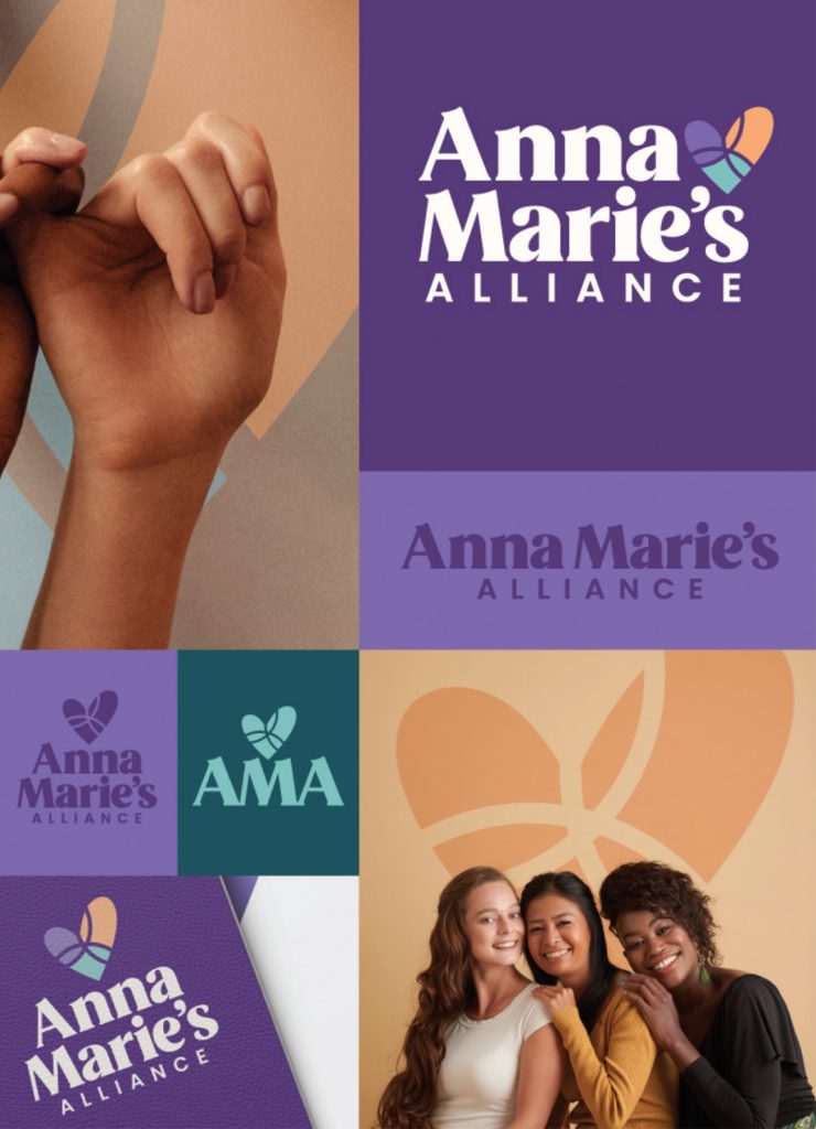
Moxie developed a new visual identity that brings the organization’s mission to life while preserving a meaningful piece of its history.
Reimagined the original heart as a mosaic-inspired symbol representing healing and rebuilding.
Made domestic violence awareness purple the primary brand color, complemented by warm, uplifting accent colors.
Introduced modern typography and a more contemporary look that reflects the organization’s evolution.
Anna Marie’s Alliance now has a brand that honors its history while reflecting the hope, strength, and healing at the heart of its mission.