Eric Heipel and his team have been painting homes and businesses around St. Cloud and Maple Grove since 2013. When they left their franchise to go independent, they needed a new name on the truck. Fast.
Going independent meant starting the brand from zero. Heartland needed an identity rooted in Minnesota that could still win jobs anywhere, and it needed to be ready to launch quickly.
A new business can’t afford to look new. People hire painters they trust, so the brand had to feel established on day one while still feeling like the family behind it.
We ran an accelerated branding process to get Heartland on the road fast.

Eric wanted a name that meant something. After rounds of namestorming, Heartland stuck: Minnesota roots and a crew that puts real heart into every job.
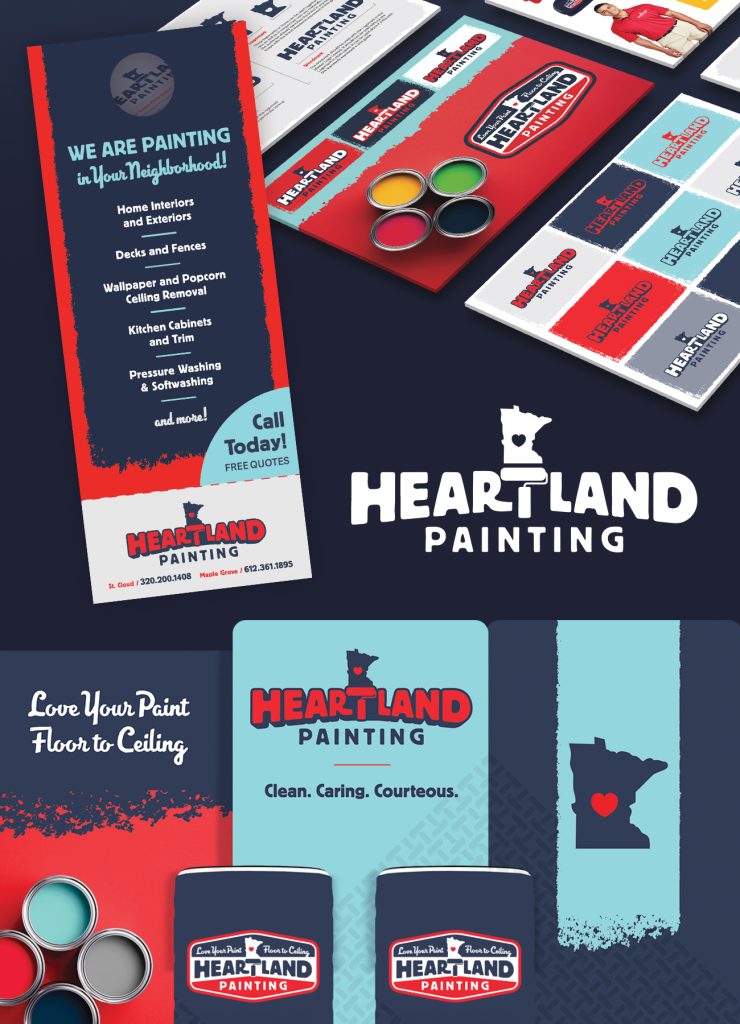
A bold logo pairing Minnesota with a paint roller, clearly showing where they are and what they do. The two blues and a deep red give Heartland a hometown feel, and they stand out on a street lined with yard signs.
Business cards, door knockers, and yard signs, ready for day one.
Vehicle wraps and a trade show display, so the brand shows up wherever the crew does.

Heartland launched looking like it had been around for decades. The values came along for the ride; the franchise didn’t.
Hear Eric tell the story on our podcast: Outgrowing the Franchise: Eric Heipel on Building Heartland Painting His Own Way.